STANLEY Access Technologies
Transforming user experience for an industry leader in accessible entrance systems
Quick Facts
Overview
STANLEY Access Technologies manufactures, installs, and services swinging, sliding, revolving, and hybrid doors. STANLEY Access Technologies is a division of Fortune 500 brand Stanley Black & Decker.
Core Activities
Stakeholder Interviews — Digital Surveys — Competitive & Industry Analysis — User Personas — Sitemapping — Information Architecture — Wireframe Sketching — UX Writing
The Challenge
STANLEY Access Technologies’ website was so confusing, staff spent more time explaining to customers how to navigate it, rather than doing their jobs.
Customers were struggling to navigate multi-tier dropdown menus that would close if they moved their cursor out of the hover state. Customers were missing useful information due to tabs that didn’t look like tabs. Architects couldn’t find specifications and drawings that were critical to their projects. Customers were using up staff’s valuable time by calling the company whenever the website failed them, which begged the question… what about the ones that didn’t bother to call?
This was an unacceptable user experience for a company that was not only an industry leader—known for inventing the world's first ever swinging automatic door more than 90 years ago—but also because accessibility was at the core of their business. “We help make the world accessible,” their brand messaging proudly stated, while website did the exact opposite.
Key Issues
↪︎ Poor navigation and unintuitive site structure
↪︎ Difficult to browse and compare products
↪︎ Product assets were not well managed
↪︎ Missed opportunities to capture qualified leads
↪︎ Lack of brand credibility
The Solution
The new website had to live up to the STANLEY Access Technologies name. Accessible. Reputable. Innovative.
While the old website was dense in information, what good was it if no one could find it? We sought to preserve the depth of information, but reorganize it in a way that was familiar to users and on par with modern UX/UI design. We aimed to reimagine how users could browse, compare, quote, and service doors. We wanted users to be more self-sufficient on the website, freeing staff up from handling the tedious phone calls they cited in all of our stakeholder interviews.
And, we were inspired to let the STANLEY Access Technologies brand story shine in a way that it so deserved.
Key Objectives
↪︎ Increase qualified leads, leveraging calls-to-action such as “Find a Rep,” “Get a Quote,” “Request Door Service”
↪︎ Simplify the user experience through navigation, product, asset library, and design system overhauls
↪︎ Amplify the STANLEY Access Technologies brand by weaving in value propositions, testimonials, and industry accolades
Header & Homepage (part 1)
Homepage (part 2) & Footer
Reimagining How Users Browsed Doors
In order to achieve our main goal of increasing qualified leads, it was paramount that we rethought all product-related pages.
This entailed a few core enhancements:
↪︎ A Doors Archive, or “Browse All Doors” page (pictured below), that was accessible via the main navigation that allowed the user to filter and sort to find their perfect door
↪︎ A mini “door finder” component placed above the fold on the homepage (pictured above) that took the user to a pre-filtered version of the Doors Archive
↪︎ A “Featured Products” component, also on the homepage, that pulled in select door cards from the Doors Archive
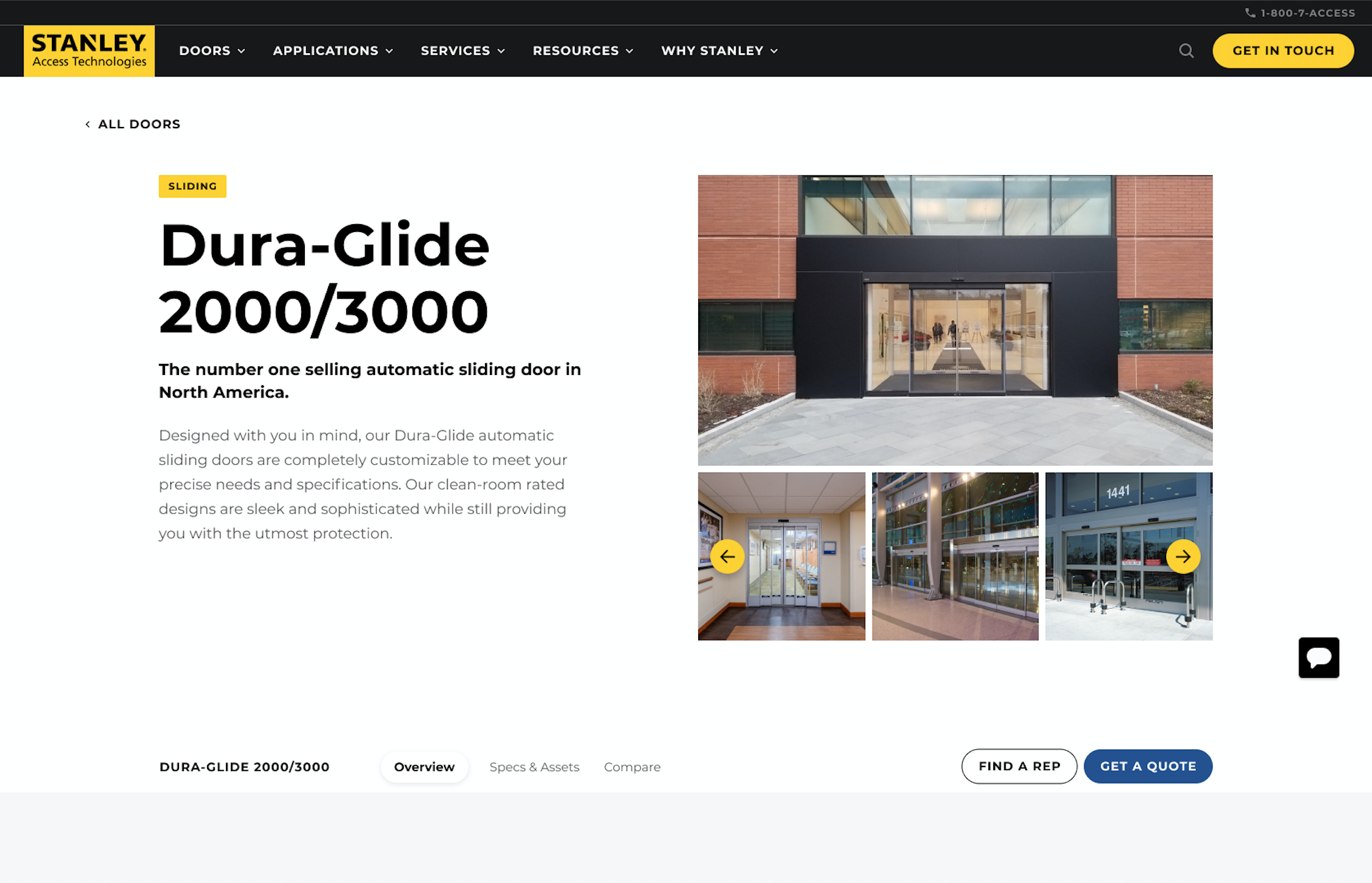
↪︎ An architecture for the Product Profile pages (pictured below) that organized information into three tabs: Overview, Specs & Assets, and Compare
The Product Profile pages are something I’m particularly proud of. I took cues from other tech ecommerce sites, such as Google Nest, Ring, and Arlo. These sites did a good job of showcasing the benefits and features of their products without overwhelming the user with the minutiae, as those product details were accessible within tabs and/or accordions.
Doors Archive — A brand new way for users to browse all doors in one view
Product Profile — a wealth of product information organized into a sub-nav/tabs
Asset Library — An all-new, comprehensive archive of product documentation
Product Profile, Specs & Assets tab — pulling in assets from the Asset Library
Some things I love about the Product Comparison…
On the old site, comparison tables were standalone pages, but on the new site, product comparisons are now within a tab on Product Profile pages. This significantly helps users find the right product, because they are now able to see the differences between similar doors without leaving the product page they are already on.
The new-and-improved Product Comparison adds new functions, such as hiding certain products from the comparison table, tooltips for extra information, and a “sticky” header that keeps all of the product names in view as the user scrolls the table.
Before — Product Comparison
After — Product Comparison
Encouraging Users to “Find a Rep”
Connecting with a local rep was a key aspect of STANLEY Access Technologies’ business model, however it was hidden, clunky, and robotic on the old site. The page to “Find an Agent” used jargon like “Retrieve” instead of “Search” and was missing the branded header, footer, and styling from the rest of the website.
The new tool not only looks a heck of a lot better, but it also feels much more warm and friendly. Also, the user can more easily jump between US/Canada and Worldwide results.
Before — Find a Rep tool
After — Find a Rep tool
Credits: Work created with a team while at 829 Studios.


